Spinner’s Mantra #2: Just because I like these colors individually does not mean I should ply them together.
I should have this tattooed to the underside of my right arm, so that I am forced to read it every time I sit down to ply.
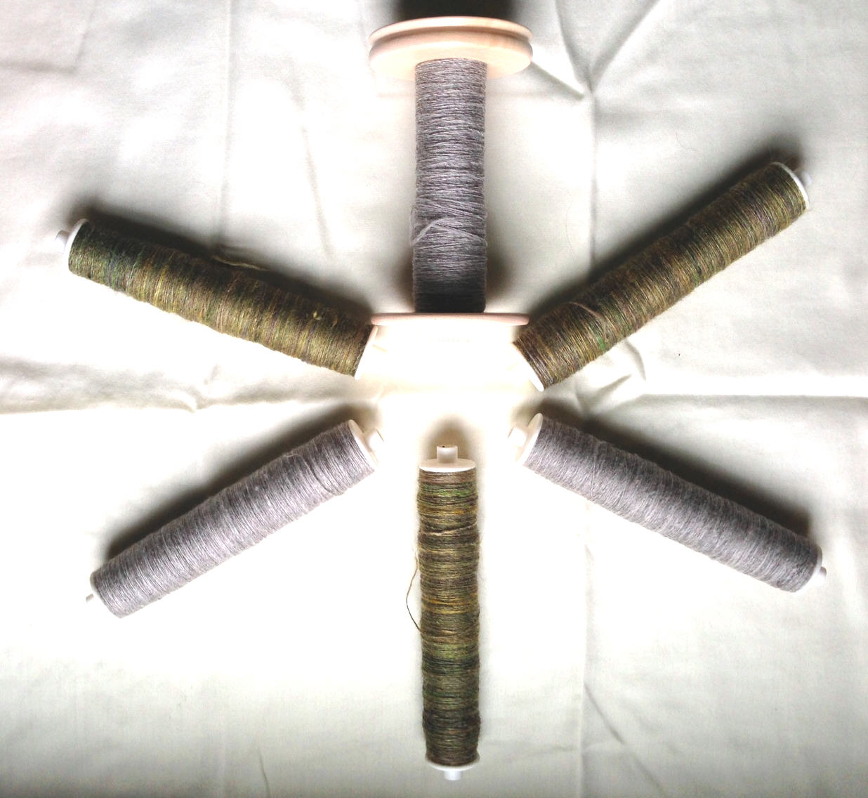
I’ve been going through my stash of spun singles trying to get inspired. I’m running out of plastic storage bobbins, which means it’s time to ply something. Here’s what I’ve got.

It’s a real mix.
From top left to right:
- Scrap singles, less than 1 oz each: Green Polwarth, black llama/wool, and silver Romney/Perendale.
- Silver Falkland merino (about 1 oz)
- Blue BFL/silk (4 oz)
- Blue Falkland merino (looks like less than 4 oz)
- Orange merino (4 oz)
From bottom left to right:
- Leftover Silver Romney/Perendale in two different shades
- Green multi Judith McKenzie batt, about 1.3 oz per bobbin
- Blue multi Judith McKenzie batt, about 1.3 oz per bobbin
- Gray Cormo, about 1.3 oz per bobbin
Gack, what do I do with all of this?
Not this:

And not this:

I could do the tame thing and ply all my like singles together with no contrast. They’d still be pretty…


But I still find it more of a challenge to find colors I can ply together. Instead of looking for contrast, how about similarity. What do you think of this?


I think this is really interesting. I agree that contrasting colors are nice, but sometimes it’s nice to blend based on similarity – it makes the best of both ‘pop’ instead of accenting the sharp difference. Also I laughed at your cat jumping up – this seems to be the knitter plague… a mischievous cat.
I like the stripe ones, both are equally nice. I was going to pick the blue/orange but then I liked the green/gray one too.
I like the blues together!
You have lots of good options. My personal taste would be to ply similar colors. The yarn will look rich and then you have more options on how to use it later.
I agree. I’m never very happy when plying contrasting colors like these. They never look as good together as they did side by side.
Oh man, you have a singles stash too? I might be in over my head with this wheel thing. I think plying the similar blues might produce a pretty marled/kettle-dyed look. Worth a try!
I just finished plying the blues. It’s looking good.
I love the idea of plying together your own color combinations. I’m going to have to learn how to do this.
As a new spinner, I am faced with the same problem. My problems are worse. As I make a wee bit of progress, the singles are themselves very different.